Thursday, 20 February 2014

Evaluation

  •  In what way does your media product use, develop or challenge forms and conventions of real media products?


How does your media product represent particular social groups?
I highlighted particular features and conventions and analysed them, to highlight the effects and the representations of particular social group. I used a table to show how it represents particular social groups and the effects. I completed this for my front cover, contents page and double page spread, to show how they all represent particular social groups.


I also set up an interview about how my magazine represents particular social groups. I interviewed a female about my magazine and her thoughts. She expressed what she thought was effective and what could be improved and also discussed the impacts of having a female rock magazine.


Transcript of Interview
C: Do you listen to Rock music?
M: Yes, quite often.

C:What do you think of my magazine?
M: It looks professional and realistic.

C: What do you think of my photographs?
M: I think the photographs represent Rock artists well.

C: Is there anything you would change about the layout on any of the pages?
M: I would make all the photographs black and white.

C: Do you think £2.99 is an appropriate price for a monthly magazine?
M: Yes because it is affordable.

C: Do you think red, white, grey and black is an effective colour scheme?
M: Yes because they are common colours in Rock.

C: Do you think it is clear that my magazine is aimed at dominantly females?
M: Yes because the photographs are of females

C: Do you think it is a good idea to have a Rock magazine aimed at females in particular?
M: Yes because Rock is usually aimed at males.

What kind of media institution might distribute your media product and why?

I created a go animate video of a conversation about the type of media institution that would distribute my media product. I decided on Hearst magazine as this seemed the most suitable and I also researched into Hearst magazines and found the below information on the website. There is a space in the market of magazines for a Rock magazine aimed dominantly at women. As Hearst magazines has a a large female audience and no music magazines, I thought it would be appropriate to suggest that this would be the type of media institution that would distribute my music magazine. Hearst magazines UK also have a large audience already, therefore the audience of this existing magazines would be more likely to buy Fury, if they like one of Hearst's existing magazines.


Who would be the audience for your media product?

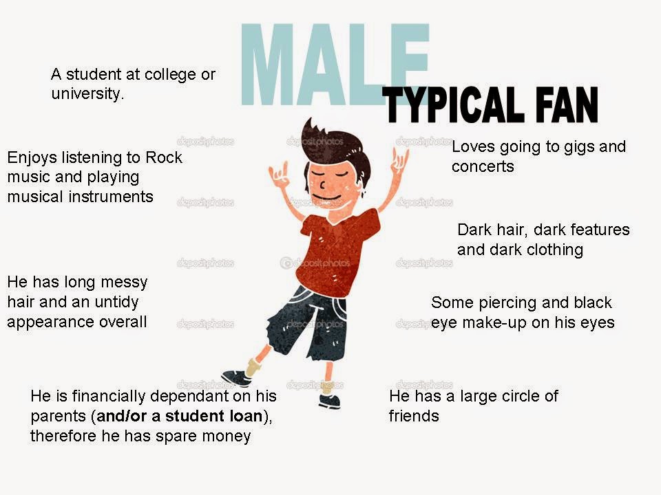
I created typical members of my target audience and annotated them with descriptions of there personality. I created one for males and females, as my magazine is effectively suitable for the reading of both genders.


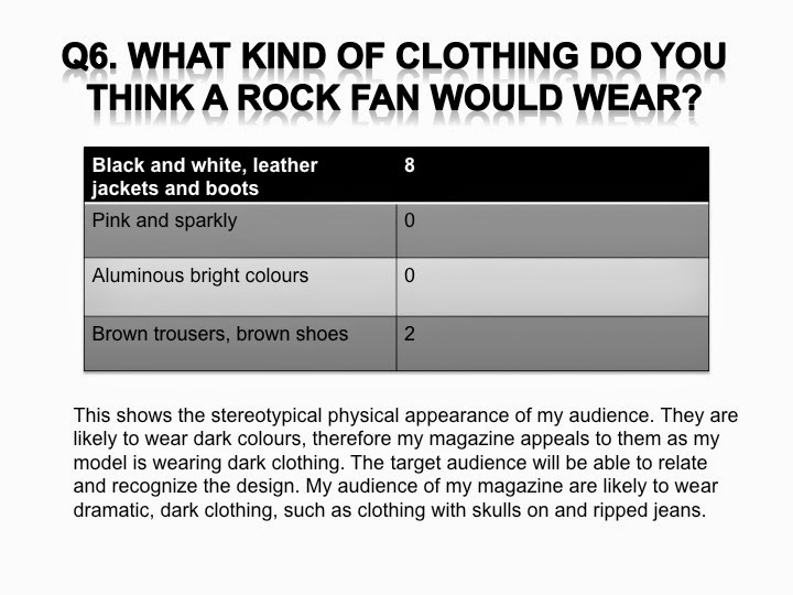
Below is the questionnaire I asked 10 people, with the ten questions and their answers. This is before I transformed the tally into representations of the answers and analysed my findings. I recorded a tally of the answers in my notebook, then progressed and developed them into representations. Using graphs, pie charts, images and tables. I also created a summary at the end, to show what type of audience my magazine would be aimed at.


  • This is the audience profile I created for my Rock music magazine, this explains what the audience would be like and what type of lifestyle they would follow. It also shows how my audience is dominantly female and the mean age is 22, which fits in with my target audience of 18-26.


How did you attract and address your audience?
I found 10 different people  to fill in the below questionnaire what I created. I created ten questions with  various different answers, which would help discover who the audience of my magazine would be, what age they were, what their personality was like, what their physical appearance is like and what hobbies they like, etc...


  • What have you learnt about technologies from the process of constructing this product?


  • Looking back at your preliminary task, what do you feel you have learnt in progression from it to the full product?

Friday, 14 February 2014

Final Versions

These are my final versions of my front cover, contents page and double page spread.
[UPDATED VERSIONS]


[OLD VERSIONS]


Friday, 7 February 2014

Deadlines


Deadlines


Front cover, double page spread, contents page and ALL research/ design process - 
14th February 2014

Evaluation and any updates to your products - 
April 17th 2014

Final grade sent to exam board - 
15th May 2014

AS Exam - 
23rd May 2014

Saturday, 25 January 2014

Article


I wrote my article on Microsoft Word, in order to put the article into the appropriate number of columns, on my double page spread, the article spreads into three columns. Also, I made sure that the height and width of the columns was a good size, therefore 5/6 words could fit on each line, in order to follow the conventions of a Rock magazine. I also did not do it like a question and answer interview, I looked at Rock magazines and how they read and were set out, and wrote about the artist, including quotes from the artist.


Friday, 24 January 2014

Drafts of Double Page Spread

This is the basic draft of my double page spread. I also used Photoshop to create this plan. With this one, I also looked at the magazine double page spread's that I have previously annotated and created the mood boards with. I made sure the pages had the appropriate conventions on, such as the main image being large and there being an overlapping title to link the two pages together. I also made sure there wfias a lot of room for text, because the double page spread always consists of an interview, or in the case of my Rock magazine, an article.


I chose this double page spread to focus on, then I had planned my ideas previously, therefore I could merge the two together. I liked the colour scheme on this double page spread as it is similar to mine, also I like the way the model was positioned on one particular side of the page, as I have tried to convey this on mine. I also like the lettering of the title, therefore I tried to do something similar, which would have the same effect on the reader visually.


Firstly, I selected an image which I though would be suitable for my double page spread. Then I used the tools to crop it and remove any excess parts of the photograph which I didn't need, I then positioned it on the left hand side of the page, as this is what most magazines do, also it is conventional to have the model take up half of the double page spread, so I also focused on this particular element.


I then added my article with the correct measurements. There are usually three columns in a rock magazine, therefore I chose to focus on this when locating my text. I also made sure, certain important parts of the article were highlighted red to make them stand out. I made sure that within the layout, there was still space for my title and quote to fit inside. Therefore, I made the text fill up approximately half the page, using the text boxes and dragging tool on Photoshop. I also used a drop cap, and ended it with how you can find and purchase her music, as well as tour dates and media sources that she will be appearing on, as I have seen this previously in my research.

Afterwards, I added my pull quote. I chose a quote which would catch the readers attention and they would be interested, as well if the reader does not read the article, they have the ability to scan for quotes and get an idea of what the artist is like. I located the pull quote in the centre of the page, in the centre column to show it's importance. I also separated it from the text by changing it's colour to red and grey, therefore it can be identified as a different convention.

Afterwards,  I focused on the quote which I wanted to apply to the top of my double page spread. I looked at the example double page spread which I was focusing on, and wanted to duplicate this title, but to fit in with my magazine. I chose the theme of red, to fit in with the important text, and applied a sharp, spiky effect, as this produces connotations of what Rock music is stereotypically like.
I made the less important words in the quote smaller, therefore these will not stand out more, whereas I made 'Female' large as this is significant.

I then used the same technique as I did with the quote at the top, and used the same sharp effect but changed the colour to black to separate it from the quote below. I applied the word 'ROSIE' as it is simple and short, and will not cram the page. I put if diagonally, as on double page spreads, this happens quite a lot, and produces the connotations of Rock being rebellious and not neat and tidy.
I tried to create the effect of Rosie touching the word Rosie, therefore this would link them together and look like she was leaning on the word.

I then tried to produce different backgrounds, to see if it would make any positive different to the look and layout of the double page spread. I chose white, red, black and grey as these are the colours that I have been using throughout the process of creating this magazine, therefore I wanted continuity. I applied a grey background, but I appeared to clash with the models jumper slightly, therefore it didn't have the same effect. On the white background, I think it looked quite planed and ordinary. On the red background, there was some clashes with the colour scheme as quite a large majority of my text was of a similar colour, as with the black background, as my article and the artists name are both in black, therefore they merged together.


I removed the text, as I needed to align it on the left hand side of the page, and still make sure that there was a reasonable amount of words of each line. I made sure that the three columns were of the same size, therefore it looked effective. I also changed the font as suggested to a sans serif font, therefore it would fit in with the rest of the magazine.

I then inserted the text back, making sure there was enough space for the pull quote to fit in. I located the pull quote in the centre, as this is quite an important aspect of the double page spread for the audience. I made sure that I still have a red drop cap to make the start of the article clear and visible.
Also making sure that the text was not too close to the photograph, edges or the title.


I changed the brightness of the photograph to more black and white by using the levels tool on Photoshop, this allowed the photograph to have a more black and white effect rather than a grey one, therefore it looked more effective and fitted in better within the colour scheme of the magazine.


I also changed the text to sans serif as this is the conventional text used, I also added the magazine logo, date and month at the bottom of the page as I had seen this in Q magazine and thought it looked good. I also realised I need to changed the font on the front cover to the font that is the same on the double page spread, as they are currently different.


Draft of Double page spread
When I was creating this draft of my double page spread, I used the lipsum website again to fill in the article spaces. I also placed on my photograph and titles to experiments and see what it would look like. When drafting I assured that the colour scheme I was using was being continued throughout the magazine, I applied conventions such as a main title and pull quote on this draft, as well as the main image taking up half of the double page spread as it steretypically does. For my real version, I will have to measure the page measurements properly as well as filling in the text and making sure the double page spread is of a good quality for people to read.


I also experimented with a text creator on the internet, to produce an eye catching title with good effects on it. I wanted it red to fit in with the colour scheme, therefore I just typed in the particular words which I wanted, then the website created the title. With the effects and  sizes I had chosen to apply.


I also inserted text, which I intended to be a pull quote. I left a lot of space at the top therefore I could spread the title out above the article. On this screenshot the main image is quite small, therefore on the next draft I had to enlarge it, to make it stand out more. I also had to consider the centre line of the page, as this was the aspect of the double page spread that I kept forgetting what I was inserting images and texts. Therefore, I have to make sure I don't locate any images or text across the line, that may be effect when the double page spread is opened and closed.


 I also used the lasso tool to make sure the edge around the image was quite neat. I also did this to make sure that the photograph would blend in well with the background. But, when doing this I also noticed that the words 'Love' on her jumper were cut off, therefore when I do another draft I will have to make sure that these words are visible, as this clothing was selected for the words to be on view. In this draft I also added the title, I continued with the red and white colour scheme and applied it to the title, and put a pull quote which was significant to the genre of the magazine.

This is what the draft looked like when I changed the title I have chosen above, and applied the new title I had created on the text website. I think it looks better and more effect on the double page spread, alongside the image, as it also fits in with the colour scheme used throughout. This is what my double page spread looks like without the text, therefore I had to leave space for my text to be situated in. I also used the colour grey this time when applying the title, as the model is wearing grey, therefore it would produce stronger connotations of the model and interview linking together.


On this version I made adjustments to the title, to make more space to fit the article in and look the layout of the double page spread look better. I also entered my article which I had written on Microsoft word into Photoshop. For this, I used a drop cap at the beginning of the article as well as an introducing line. I also applied a page title and a glass effect on the title. I have also made space for my pull quote.


Different titles

I used Powerpoint Presentation and various different websites (e.g.- cooltext.com) to create different titles, with different colours, shapes and sizes. I used my colour scheme of black, white and dominantly red when creating the titles, therefore they would fit it when I applied them to my front cover. I applied effects to the main title, main quote and pull quote to link them all together. I used the same font for my article and for the page title, to also link these two together.